All work
Case study 04 · Accessibility
Sehat Sathi
A medical tracking experience for people who did not grow up with apps: older adults and less technical users who still need their history to be accurate and easy to find.
- Role
- Full stack engineer
- Focus
- Accessibility, UX
- Stack
- Web, data modelling
- Standard
- WCAG as a baseline
What was broken
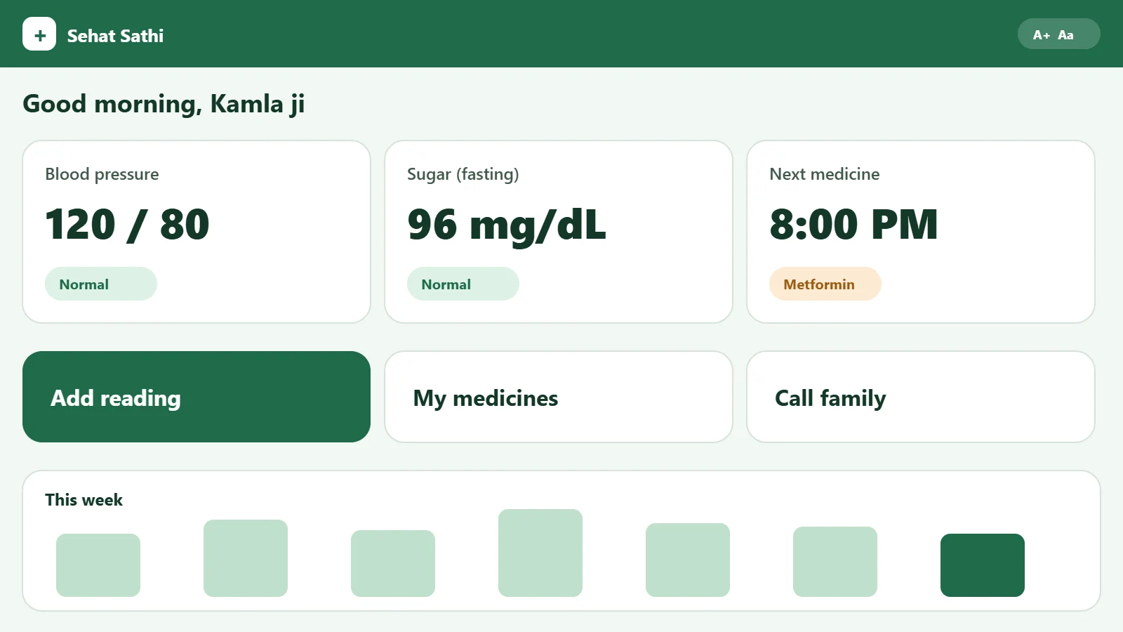
Most health apps assume a confident user on a fast phone with good eyesight. For older users, small text, dense screens and unclear navigation meant abandoned flows and repeated support questions.
How we built it
- Fewer decisions per screenEach screen does one job. Primary actions are large, labelled and in the same place every time.
- Readable by defaultLarge type, high contrast and plain language throughout, tested against WCAG guidelines.
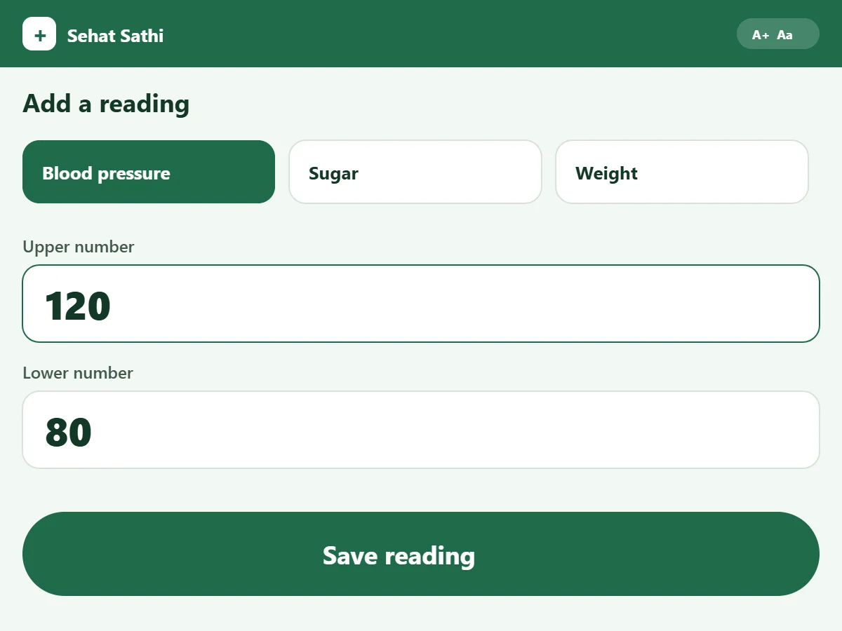
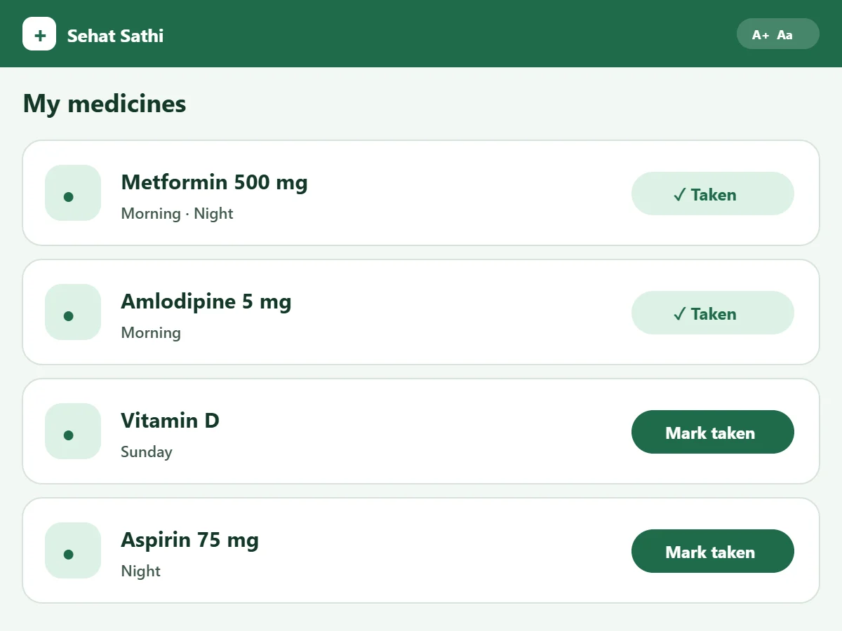
- Useful defaultsCommon entries are pre-filled or one tap away, so recording a reading or a medicine takes seconds.
- A history people can findRecords are organised by date and by type, with simple filters instead of search syntax.
Inside the product
The real product is confidential, so these screens are illustrative mock-ups. I can walk you through the real product on a short call.
What changed
Lower cognitive load for first-time users, seen in fewer abandoned flows and fewer support questions about navigation.
“If an interface only works for a confident user on a fast laptop with good eyesight, it is unfinished.”
Next case studyCRM Platform
Read next